Typography
The guidelines and recommendations for using fonts and typography to create visually engaging and consistent content for our brand.
Our Fonts
Consistent use of these typefaces strengthens our brand identity and ensures a cohesive visual experience.
Headlines
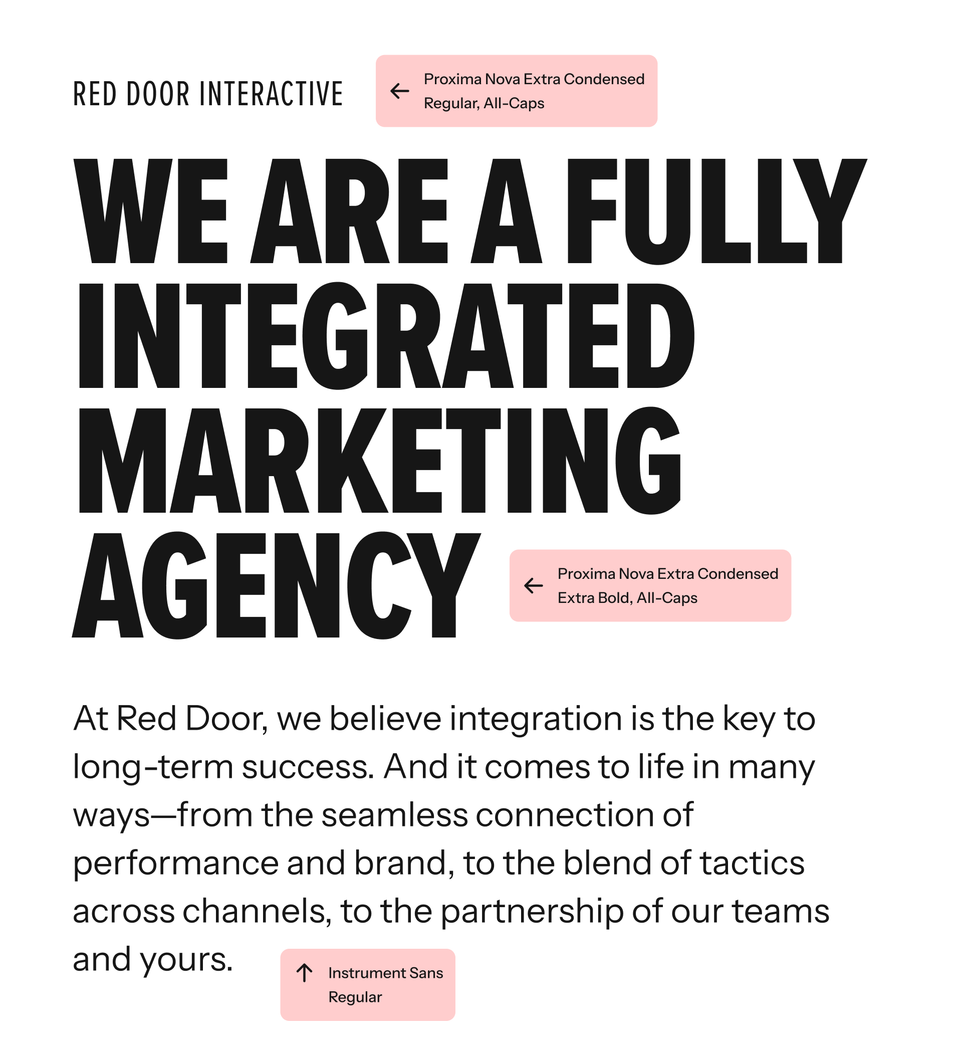
Proxima Nova Extra Condensed
Weights: BOLD, Regular
(All-Caps)
Used for short, impactful headlines. Proxima Nova should always be set in all-caps and should not be used in cases where excessive line wrapping may occur.

Body Copy
Instrument Sans
Weights: Normal, Medium, Bold
Designed for optimal readability, Instrument Sans provides a clean and modern look for body text across digital and print applications.

Usage Guidelines
Below is a sample showing the relationship between headline and body copy fonts.